Friday, 16 December 2011
Wednesday, 14 December 2011
More Changes made
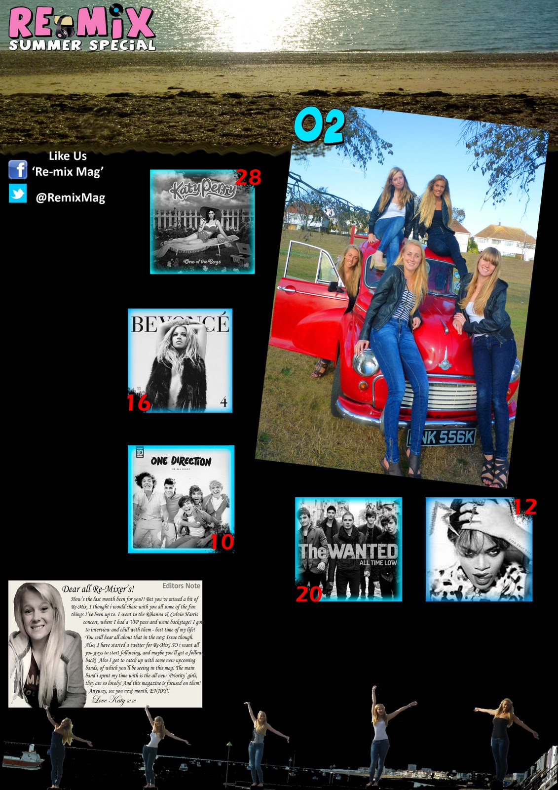
I have included links to social networking as social networking is an interest of my target audience, and it also it a way of promoting my magazine in other ways, and creating a bigger relationship with my readers.
Where i have wrote the page number by the pictures, i used the spray eraser tool, which gives a spray paint effect, so the erasing has dispersed over the area i removed. The pictures are black and white so that the main picture (Of priority) is the definite main attraction, i have also shown this by giving the page number of the main picture a different colour and font (the font being the one used by the typography of the magazine title) giving links that it is the main picture, again.
Thursday, 8 December 2011

Wednesday, 7 December 2011

Background

Changes to contents
 |
| This is the original picture which i will crop to put the picture at the top of my new contents page. |
 |
| This is using the rule of thirds, to evenly include the same proportion of sand, sea and sky. |
 |
| This one uses the rule of thirds to separate the sea, the sand, and the stoney sand. I have boosted the colours in both of the images. I think i will use the bottom one as it is just for the very top of the page, as I am changing the layout of my contents page to be more like the one below. As i found my previous contents page did not look mature enough or right for my magazine, to suit the front cover and the double page spread. |

Tuesday, 6 December 2011
Edit of Double Page Spread


Subscribe to:
Comments (Atom)