Friday, 16 December 2011
Wednesday, 14 December 2011
More Changes made
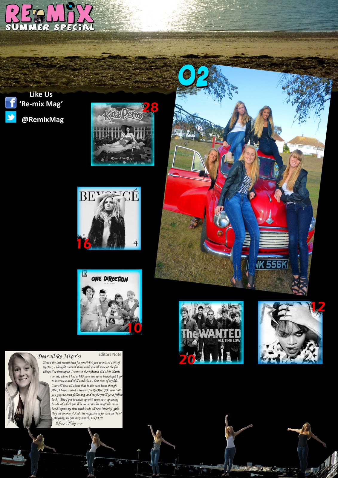
I have included links to social networking as social networking is an interest of my target audience, and it also it a way of promoting my magazine in other ways, and creating a bigger relationship with my readers.
Where i have wrote the page number by the pictures, i used the spray eraser tool, which gives a spray paint effect, so the erasing has dispersed over the area i removed. The pictures are black and white so that the main picture (Of priority) is the definite main attraction, i have also shown this by giving the page number of the main picture a different colour and font (the font being the one used by the typography of the magazine title) giving links that it is the main picture, again.
Thursday, 8 December 2011

Wednesday, 7 December 2011

Background

Changes to contents
 |
| This is the original picture which i will crop to put the picture at the top of my new contents page. |
 |
| This is using the rule of thirds, to evenly include the same proportion of sand, sea and sky. |
 |
| This one uses the rule of thirds to separate the sea, the sand, and the stoney sand. I have boosted the colours in both of the images. I think i will use the bottom one as it is just for the very top of the page, as I am changing the layout of my contents page to be more like the one below. As i found my previous contents page did not look mature enough or right for my magazine, to suit the front cover and the double page spread. |

Tuesday, 6 December 2011
Edit of Double Page Spread


Thursday, 24 November 2011

For the words 'Exclusive Summer Special' i tried out 2 different fonts. One is the same font as the logo for 'Priority' and the one on top is the same font as the logo for the magazine 'Re-Mix', however when using the writing on top (The remix logo) i realised that it looked very bloody and halloween like, and the one on the bottom looked more elegant. So i will use the one on the bottom.
Wednesday, 23 November 2011
23/11/11
Today I have sorted out my layout for my double page spread, and sorted out what will be said in it. I also looked through many double page spread layouts that have been done in previous music magazines, so I could find the layout that I wanted, however I have seen that no magazines have used my unique design and have therefore found one that goes by partly the same design.
DPS Layout


Tuesday, 22 November 2011

Monday, 21 November 2011
Wednesday, 16 November 2011
Semantic Field
Words that could be used to link to my band:
Loud
Sociable
Fasion
Talkative
Unique
Amusing
Fun
Pretty
Pop/R&B
Feisty
Down-to-earth
Up beat
Intertextuality
What would my band be interested in?
My band are 5 girls, that share many features with The Saturdays.They are called PRIORITY. They sing songs in the cross-genre of Pop and R&B, which can be upbeat.
They spend their spare time shopping, cinema, listening to music, seeing friends and family, going to the gym, reading magazines and going out for meals.
They love to go clubbing and meet new people! Their personalitys are all very confident, chatty, humerous, positive, and understanding. They try to raise money for charity at any chance they can take.
Priority love meeting all their fans at CD and Book signings!
Tuesday, 15 November 2011


Monday, 14 November 2011
Finished Front Cover!


Saturday, 12 November 2011

After placing the R and the X behind the beach hut, I realised that something didn't look right about it. For it to look good i wouldve needed to place all letters behind the beach hut, not just two. However when i tried to do that, you couldnt see any letters. So, i brought all the letters back out from behind to normal, and copied the logo. I then placed it over the top but to the side really slightly, giving it a more 3D effect. My focus group said that this looked a lot better.
Thursday, 10 November 2011
Wednesday, 9 November 2011

Magazine Title
I have chosen to name my magazine 'Re:Mix' as it has a good connotation of music. My magazine includes the genre's of Pop and R&B, and therefore is a mixture. So by having Re:Mix, the audience should no that in an email the 're:' means what it is about, so it shows that this magazine is a mix.


Tuesday, 8 November 2011
Front Cover Picture Choice

Tuesday, 1 November 2011
Youth Subcultures + History Of the Music Press
The introduction of The Beetles and The Rolling Stones in 1960's changed the nature of music and the way it was written.
Music Video's became popular in the 1990's.
The audience in Pop Music is so varied that record companies never truly know how to target them.
Monday, 31 October 2011
Thursday, 27 October 2011
Picture Locations

Thursday, 20 October 2011


Wednesday, 12 October 2011
Tuesday, 11 October 2011
Masthead for magazine front cover and contents (quick sketch)

This is a quick sketch of what i would like my front cover of my sixth form magazine to look like. I thought of calling it 'InFORM' because it links to sixth form, whilst also showing that it will inform the readers of the contents, up the side of the 'M' will be the website. Each of the puffs on the side will have the word FORM in, i will highlight this buy giving them a different colour to the rest of the text. The moto will be underneath the title, as if it were a subheading. The model on the front will of had a mid shot picture, with a fashionable top showing, whilst holding a notepad.

The heading 'contents' will be in a bold, colourful writing. The main
photo will be of a girl standing on the right hand side of the photo,
with another attraction in the background of the left hand side, she
will look happy and welcoming. I will have the contents of the pages in a
faded box, explaining what can be found inside the magazine. This box
will be slightly coloured but with a high opacity, because there will be
so many different colours in the background, that the writing will not
stand out, and i do not want to use a block colour as the background as
it will hide the majority of the background. There will be a tree or
pond in the background. Underneath will be a discount of some sort,
which would attract students, as saving money on school resources is
always a bonus. Then beneath that will be a shot of the magazine front
cover, along with two more shots of people enjoying life around school.
Then at the bottom left of the contents page there will be the magazine
title (in the same writing as on the front) and the moto, to show some
replication from the front cover.
Sunday, 9 October 2011
Edit of the photograph
I edited the photo that i have used for my front cover. I followed the 'Rule Of Thirds' and made Maisey slightly more central, bringing more attention to her. Then i blurred the edges, but not so it was really bold and noticeable,but just to give an extra element to the attention being at the centre of the magazine. I zoomed in on the image, and used a tool where i could click on the part of the image where i wanted to collect the colour, then I went on colour picker, and went a couple of shades lighter to make her teeth appear whiter. Then i did the same with her green eyes, but i put a splash of the brightest green from her eye to the corner of her eyes, which gave them more of a sparkle.Then i made the colours in the picture 'warmer' and increased the contrast slightly, this makes the girl stand out a lot more than she did before, and the colours more vibrant, and therefore more appealing to the eye.
Thursday, 6 October 2011


Wednesday, 28 September 2011
Title Typography

Front Cover Photograph


I will edit the photograph on the right, to remove blemishes and adjust the lighting slightly, to make it a better photo for my front cover.
Sunday, 25 September 2011

Tuesday, 20 September 2011
What I Learned 20/09/2011
Media Language
That the language we learn about in media, isn't just written or spoken, it is what is portrayed by the media, such as how angles of a camera are like a language for us, how we know what when a camera from above looking down on someone is too make you feel bigger than them, or to show that they have done something wrong etc, or how without hearing a phone conversation, by the looks on the receivers face, we can have a guess at what the conversation is about, and what is being said, whether it is good or bad etc.
Form and Style
How all the 'micro' elements combine to give the form and show the style of the drama. The micro elements are those such as dialogue, sounds effects, editing and ambience.
Convention
Conventions are the 'ingredients' that make up the 'recipe' for that certain genre. All convetnions are those that in the certain genre drama, they are the things that you would expect to see or to happen.
Signification
Signification is applied within a theory called 'semiotics' (the study of signs). This is where a sign has a denotation and a connotation. The connotation is what the sign means, and the dennotation is what the sign actually is. For example, a skull and cross bones, well that is the denotation, however the connotation is danger, or pirates, or death even.
Representation
That representation is how the media text wants to present a certain factor. That what a media text presents something as, may not be how it really is, it is how that media text wants to represent something. This is representation.
Audiences
That a media text may be justified to suit the certain target audience, so that it is best agreed or interested to the audience. And that many media texts are suited to the secondary audiences, more than to the primary.
Narrative and Genre
Every drama must have a narrative - this is the story line. Without a narriative, the media text would be compleyely pointless, and no one would watch it. A narrative is what gets everyone intised in the drama and watch each episode together. The genre is the 'type'. It is how each media is classed, for example in magazines there are music, gossip etc, for music rock, reggae, pop etc and films there are comedys, romance, horror etc! The genre is classed on the conventions which each thing in the media text include.
Creativity
This is the 'performance descriptor'. Every media text has a kind of creativity that has been used within it. 2 Levels: first is the ability to use the digital technologies and the second is the ability to engage the audience!
Connecting the micro to the macro
Micro elements are all those small simple things that add up to the macro element. The Micro elements could be props used, or lighting, or editing, and the macro element is what each of the micro's add up to make.
Wednesday, 14 September 2011
Edited Pictures


Tuesday, 13 September 2011
How To Take A Good Photograph
1. Composition (What is included within the frame)
2. Rule of Thirds http://en.wikipedia.org/wiki/Rule_of_thirds
3. Focus (Using correct depth of field) http://en.wikipedia.org/wiki/Depth_of_field
4. Lighting
5. Camera Angle - Experiment
2. Rule of Thirds http://en.wikipedia.org/wiki/Rule_of_thirds
3. Focus (Using correct depth of field) http://en.wikipedia.org/wiki/Depth_of_field
4. Lighting
5. Camera Angle - Experiment
Subscribe to:
Comments (Atom)